January 27, 2011

Double Page Spread

In order to create the double page spread needed to use a different type of software. To make the double page spread i used In Design.
I made a new document, and set out a layout of 6 collumns, in which the text and images would fit into.
I then copied some text from a word document, into the collumns and placed both images onto the page.


The wrap tool was then used to wrap the text around the images.

Above is the practice draft of the double page spread.

I chose to use In Design in order to create the double page spread, as this software is commonly used in the creation of real music magazines. Once i had entered the chosen images into In Design, i "tested it out" my entering some text from a document to see if the text was able to wrap around the images.

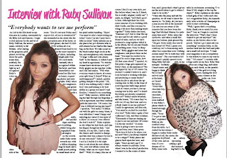
I used the text wrap tool in order to make the text in the article wrap around the image. Once i had entered the text and used the "text wrap tool" the final double page spread looked like this:


editing the photos


Both of the photos were placed into photoshop in order for them to be improved and suitable for the double page spread of a music magazine.
The photos were cut out using the magic tool, and were both had their brightness and contrast raised in order to improve their quality.

choosing the photo for the double page spread

These are the three possible photos for the double page spread.

After acquiring the opinions of 30 members of my target audience.

The chosen photo was the second photo and the last photo.

(ADD PHOTOGRAPH OF TALLY CHART)


January 21, 2011

evaluations of the front cover and contents

Once i had created the front cover and contents, i asked three people to evaluate my work. Here is the feed back i received.

Person one:
Photograph is well lit, and centered well, however you may need to tidy u the cutting out of the images better, by using an eraser. I really like the title, as the font and word "KUBE" work well together. Uniform style works well too.

Person two:
I like to suitable colours used throughout, as it resembles the target audience well. The title of "Ruby Sullivan" could have a thicker outline to make it stand out better.


(include picture of feed back)

The finished contents

Once finished the contents looked like this.
I used the colour scheme from the front cover of grey and pink, in order to create a house style throughout the magazine.

I also included the headings on the front page, on the contents, in order to link the two pages of the magazine together. Both of these ideas create a house style for the magazine.

The image was lightened so that it was more attractive and noticeable to the reader. Similarly, the "EXCLUSIVE INTERVIEW" was made larger and bolder in order to draw in the readers attention, as was the other headings throughout.

stage three of the contents

I then added the rest of the contents pages, and subjects. I chose subjects which are likely to appear in a music magazine, and which resemble the pop genre.

I also added an index section, of all the artists featured in the magazine, which i found to be quite popular in most music magazines, so the reader is able to go straight to the page about their favourite artist.


To improve the contents, i then added headings, to distinguish the different sections of the magazine. I also made the background colour of the index column white, in order for it to be separate from the rest of the page, and stand out.

stage two of the contents

I then began to create the text for the contents.
I used the bright pink for the numbers of the page, as this stood out well, making it easy for the reader to distinguish the page number from the rest of the text. The font of this text was also of "Bondont stvy ITC TT", which is the same as the title of the contents, resulting in a house style throughout the contents page.

creating the contents

In order to create this contents i firstly, made the background a light grey, as it is very similar to the background gradient on the front cover.

I then selected the image, cut it out using the magic tool and placed it in the bottom right hand corner of the page, so that there was plenty of room for the text.

The title of the contents was then created. As a font i used the Bondovi sty2 ITC TT, and made it black. I chose this font as it was bold out stood out well from the grey background, whilst also looking suitable for a magazine.

January 06, 2011

front page stage four


I then created a box at the bottom of the page, by selecting the rectangle shape tool and positioning it and the bottom of the page. I then changed the transparency, of the shape, and entered a text box.

This transparent shape, contains the text to promote the magazine further, by advertising the free magazines inside.


Finally to improve the magazine front, cover i made the image a little brighter, in order to make her the main attraction of the magazine, and finally i also centered the position of the text "Ruby Sullivan".

front page stage three

I then added the text "Ruby Sullivan" to the front page, introducing the main subject of the magazine. I chose to position the text in a large size, in front of the image, in order to attract the customers attention and make them want to read the magazine.
The chosen colour scheme of this front page, is of pink, grey and black. I have chosen pink as it was picked from the colour of the models lips, and dress. The black choice of font, was not picked from the image, however it contrasts well with the pink, whilst also standing out well from the light grey background.

the front page stage two

I then began to add the magazine headings. I chose to make some text larger than others, in order to make the word stand out, and attract the customers attention well.
I chose headings which i thought were relevant to a music magazine, and the pop genre. I also researched Q magazine in order to gain ideas of what to put as headings on the front page.

the front cover stage one

Once i had chosen the image and the title of the magazine, i then placed both of these onto photoshop, and rearranged them into the position which looked the best.
I then decided on a background, after playing around with the gradient tool for a while i chose this faded grey to white gradient, as it made the title of the magazine and image stand out well, and would be easy for more text to stand out on this pale background.