December 16, 2010

Editing the image for the front cover

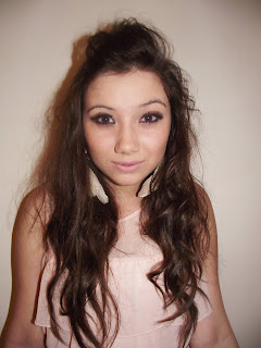
Once the image for the front cover had been chosen i needed to edit it in order to make it look sharp, and suitable for the front cover of a music magazine.
Firstly i placed the image in photoshop and used the magic tool to cut the model out from the surrounding background.
I then used the brush tool and changed the colour of her lips to a lipstick pink, in order to make them stand out better.
I then changed the brightness, contrast and vibrancy of the image which made a dramatic change.
(The image on the right is the new and the image on the left is the old)

Choosing the photo for the front cover

I took a total of around 120 photos for the magazine. Out of them photos i chose these four as the possible front cover photo.
In the end i chose the first photo, as it is well lit, is a medium shot, and she is looking directly into the camera, and from my research of music magazines, this was the most popular choice chosen from the questionnaire, and these were the results.

PHOTO ONE: 15 votes
PHOTO TWO:3 votes
PHOTO THREE:10 votes
PHOTO FOUR: 5 votes

Choosing the colour of the title

Once the font of the title of the music magazine had been chosen. I then needed to choose an appropriate colour.

In order to do this is selected six different colours and placed them underneath one another so that i good Analise which one would be best suited to the magazine.
Once i had looked at the photo which is going to be on the front cover of my magazine i soon realized that the title of the magazine needed to contain similar colours to the image.
I then asked 30 people who prefffered the pop genre, which colour they thought best suited a pop music magazine, and the results were as shown:


With these results in mind, the Bright pink colour was chosen for the title of the fornt cover, as this was the most popular choice, as shown by the target audience.

Choosing the font

In order to choose the most appropriate font for the music magazine, i created a text box and changed the fonts of the text several times. I ended up with these six different fonts.

The text is of a font of "CGF Locust resistance" which is a bold title which would stand out very well on the front page. However, it seems a little too bold and over powering for the genre of "pop". The next text is of "Arial" font. This font is very simplistic and easy to read, meaning it will stand out to the reader or buyer. However it is not extremely attractive and may come across as being a little dull. The third piece of text is a font called "Edit undo line BRK". This font is attractive and represents the genre of pop well, with its different way of font. However, if i were to choose this font it would have to be made large in order for it to be read clearly. The fourth choice of font was "BIRTH OF A HERO". This font is different from the others, making it original. However, it seems this font would suit better a music magazine of a "rock" genre. The fifth font was called "Courier". This is a well known and quite popular choice of font. However this may mean that my music magainze is not origincal if it was to contain this title. Finally. the last choice of font was of " Times new roman". This is proberbly the post well known font as it is used in Microsoft word by people everywhere. However, I belive this would not be a suitable font for a pop music magazine, as this font better represetn a word document.

These fonts were then showed to a group of 30 people, and they were asked to choose one type of font for the front cover. A list of these fonts was shown on computer, and a tally was made of the results, as shown:


With these results in mind the "Edit Undo line BRK" Font was chosen.

November 26, 2010

research into magazine name

In order to choose an approriate name for my magazine, i needed to ask my target audience for their opinions and views.

I chose ten possible names for my music magazine and then asked sixty people to vote for which name they thought would be best for my music magazine.

These were my results:

KERCHING: one vote
BEATZ: six votes
RELENTLESS: five votes
KUBE: twenty votes
CREASE:three votes
PULSE: fifteen votes

Image of the votes:

With these results in mind, i have come to the conclusion that the name of my music magazine will be KUBE

November 25, 2010

planning of the magazine

I am going to create a music magazine, which will include four photographs, and be made up of a front cover, contents, and double page spread. When planning the magazine, I firstly needed to choose what genre the magazine would be. In order to do this i researched different magazines, with different genres.
After looking at magazines such as Q magazine, Kerrang and Kiss.

After looking at these different genre magazines, I have decided tat the genre of my magazine will be pop,which represent music artists such as, lady Ga Ga, Beyonce, Neyo, J-Lo and Pixie Lott.


November 24, 2010

INSIDE
There are roughly 130 pages within this magazine.
twenty six of which are adverts,however there are also eight advertorials.
These adverts can be catergorized into types, which include: clothes, albums, and events.

Within this magazine there are roughly 32 double page spreads.

The maagzine maintains a unified house style throughout by using similar colours throughout the whole of the magazine.
60% of this magazine has a dark background.
Similarly, a similar font to the one used on the front page is used throughout.
This house style is appropriate for the target audience, as it used electric eye catching colours which resemble to those of a night club.

text on the front cover


The cover lines situated on the front cover promote the magazine by advertising what is inside the magazine, tempting the customer into buying the magazine and wanting to find out more.
The cover lines promote the interviews within the magazine, and the upcoming events which themagazine advertises.
The launguage used on the front cover of this magazine is very simplistic, yet affective.


Although the text is very short and sweet, it attracts the readers attention with its bold font and bright colours.

This cover is very simplistic in comparion to other music magazines such as "Q".
However similar to Q, Mixmag contains a lot of coverlines alog the


left/right side of the page.


However, unline Q, Mixmag focuses a lot more on the title and subheadings, than the image.

THE COVER

The name of the magazine is "Mixmag" it has been given this name as it resembles the "mixing" of the dance music which is included in this maagzine. The name also corresponds with the DJ'ing which is featured in this magazine.


The title of this Magazine is of a bright illuminous colour which stands out well on the dark photographed background. Similarly, the colours used in this title are they repeated in the coverlines of the magazine.

The main image of the magazine is of a DJ and a crowed. Although there is not a lot of colour in this image as it is very dark, and you can only see the outlines of the crowed, which makes the title of the magazine stand out well.
This image reaches out well to the target audience, as it represents the type of music (club/dance) with the DJ on the front cover.

Magazine analysis-Mixmag magazine

General
Mixmag Magzine

The company which produces this magazine is ...
The target audience of this magazine is older teenagers of the age of 18-24 who share an interest in dance music such as club and hiphop.

To buy this magazine it costs the customer £4.20 which is quite a heafty price, however the cause of thie high price may be due to the inclusion of a cd on the front cover, as the costs of this also has to be included in the price. to make up for any losses.

The magazine is published every month, and this monts edition is novemeber 2010.

The circluation of this magzine is £26,116
It also has a monthly revenue stream of...

ANNOTATED ANAYLSIS OF THE COVER.


November 23, 2010

Kerrangs House style

This kerrang magazine acheives a house style throughout by using the colours which are including in the front cover, such as in the title and other text, and including that throughout the magazine.

For example the colour from the text "PARAMORE" on the front page, is used throughout the magazine, in other title.


Similarly, the use of the yellow text included on the front cover, is also used in the contecnts and on other pages throughout the maagzine.

The magazine also acheives a unified house style, by using a similar font for titles and general text throughout. Simialrly, the use of launguage throughout is of a simialr taste, with short sentences used throughout in order to attract the readers attention.


INSIDE KERRANG MAGAZINE


There are double page spreads within this magazine.
Three of which are on interviews. These interviews are of Paramore, Angela Gossow, Marylin Manson, and The Dammed United.

The magazine also contains double page spread on albums, on sale and there ratings, as well as upcoming events and gigs including past events such as
forum London.
Similarly some of the double page spreads are posters of bands and performers.

INSIDE KERRANG MAGAZINE

INSIDE kerrang there are 64 pages.
There are 18 pages of adverts within this magazine. The adverts vary in different types which include television programs, gigs, and clothes
.

This magazine contains a variety of article topics.
These include an interview with Paramore,
as well as an interview with Marilyn Manson, and adverts throughout.

discussions of recent gigs and events and dates of these.
Therefore, these topics can be categorized into types.
These include, interviews, events, adverts and discussions.


HOWEVER, some magazines are advertorials , meaning that it is not clear whether something is an article or an advert or both. This magazine does contain an advertorial, where the page contains an advert for
vodafone as well as an interview.

November 19, 2010

A lot of the content of the magazine is promoted on the front cover. This includes the four giant posters inside, an exclusive with paramore, and the chance to win a trip to Barbados.

The connotations of the font used for the title and the main cover lines seems to be similar to a font i have previously used "28 days later". The use of both red and black font goes well together, as the black has been picked out from the title, and the red corresponds well with that. Similarly, the use of the yellow font is similar to the colour of the girl in the main images hair, and it has been picked out from here, and used in a font. The use of graphics within this front cover has been used a lot. The front cover contains a total of seven smaller images and one main image. These images correspond with the cover lines, and attract the readers attention well.

The language used within this front cover, is very simplistic, with catchy slogans and short sentences which attract the readers attention and make them want to read more. The magazine used exaggeration within the front cover by referring to Paramore revealing their most PRIVATE photo album.

A similar magazine to this one is "rock sound" not only does this particular version also include the image of Paramore but this also shows it has a similar target audience, and gender music. However, this magazine does not include as many cover lines, and has a different use of layout to Kerrang. Kerr

November 18, 2010

Magazine analysis- Kerrang the cover

The cover:


The magazine Kerrang
was given the name of Kerrang as the name is onomatopoeic and refers to the sound made by power chord or a electric guita0r, which goes well with the fact of the magazine being a rock/ grunge magazine. This name has now also been adapted onto radio and music channel as its popularity and demand for this type of music has grown.

The title of this magazine is large and outstanding from its white background. The font of the master head is a shattered font which resembles the rebeliation of the genre. The use of this font and its colour of black, makes it stand out well on the white background behind it.

The main image is of the main singer of Paramore. In the picture she is posing a cheeky, wink and smile with her head tilted, with her gase looking onto the camera. This is a very fun image. You are unable to see much of the clothing at this is a medium close shot, however we can see she is wearing a Grey top and a silver chain. The main image helps to reach out to the target audience as she is the main singer ofa popular new band, paramore,and therefore would be recognized by the target audience.

Along with the main image, there are four images of bands a long the left hand side of the front page. These have been positioned here to correspond with the text which reads "4 GIANT POSTERS!", in order to advertise and promote the magazine.and the posters inside. There are also another four images of Paramore underneath the main image, which promotes the text "PARAMORE their private photo album revealed!".


Magazine analysis

General:
Kerrang magazine is a rock magazine published by Bauer Consumer Media.

The target audience of this magazine are teenagers ages 15-19 who have an interest in rock
and grunge music. I am given this impression as the front cover contains several images of rock bands such as Paramore and My Chemical Romance. Similarly, the use of font on this front cover are very bold and scream out to the reader rather than be subtle, which also gives the impression that this magazine is a rock or grunge magazine.

The price of this magazine is my local news agents was £2.20, and is published monthly.

The circulation of this magazine is rock music and the bands.
It also focuses on reviews and interviews on music and bands in the industry.


On the ABC website there is information on this magazine. This website informs us of the product type, sector, Media owner, former names of the magazine, and when it joined ABC, which was in 1990. It also gives the full address and contact number of the Kerrang establishment.

This magazine contains sixteen pages of adverts, meaning that's it has an approximately high monthly revenue through advertising. This magazine charges different costs for advertsing in their magazine depending on the size of the advert.

For example Kerrang charge £9092 for a double page spread advert. However they charge £2607 for a half page advert.

ANNOTATED ANALYSIS OF THE COVER


November 11, 2010

final front cover and contents page


contents page

This is the contents page of my school magazine.
I have included a bold title reading "contents" which will stand out well and attract the readers attention. I have also included three images, which correspond well with the text which is included. I used the colour scheme of black red and white, as i have adapted these colours from the front page of my magazine. The contents contains large subtitles which separate the contents whilst also making it easier for the reader to read and understand the text.

November 05, 2010

stage three of my preliminary task

My front cover now includes more information about what is included in the magazine. I have kept the text on the left hand side, with some text positioned at the bottom. I have changed the colour scheme to red,white and black, as they are correspond well with what Eddie is working.

I have also included the small circle in the bottom right hand corner, which announces "free revision timetable" to advertise the magazine and promote it to the pupils well.

November 04, 2010

stage two of my premilinary task

After cutting the image of Eddie out.I lightened and contrasted the image in order to make it look its best. I wanted to place him onto a different background, so i chose the photo of a desk and cupboard from a class room and placed it behind the photograph of Eddie and positioned him on the desk. I had then created the image for my front cover.

Next i needed to create a title, after trying out several different fonts i chose "You Are Loved", font size 72, white. I then edited this text and enhanced it by selecting the blending option, and selecting drop shadow and Bevel and Emboss, in order to make the title stand out well. I then used the same font with the same blending options for the subheading "news" and changed the colour to black to make it stand out well.

I have now started to include text advertising what is inside the school magazine, and i am going to continue with this, and play around with different types of fonts and colors for this text.

November 02, 2010

My starting photo

This is the photo i will be using for the front cover of my school magazine for the preliminary task.
I took quite a few photos of Eddie, whilst in his physics class. However, this photo had the best lighting and positioning, therefore i have chosen to work with this photo.

October 14, 2010

Preliminary Task

Preliminary exercise:
using DTP and an image manipulation program, produce the front page of a new school/college magazine, featuring a photograph of a student in medium close-up plus some appropriately laid-out text and a masthead. Additionally you must produce a mock-up of the layout of the contents page to demonstrate your grasp of DTP.