I believe that my media product is targeted at the Townie social group, which i discovered using UK tribes. The Townie group enjoy listening to music of the pop genre, whilst taking a Strong interest in celebrities, and fashion. I personally also enjoy this type of music genre, and therefore i can relate this to myself and friends who also enjoy the pop music.

As you can see from the front cover of the magazine, the model looks and dresses similar to one of those of a real pop music artist. Similarly, the use of colours are similar to those of a pop artist. The image relates well to the target audience, with the use of pink throughout and the "girly" look which the model possesses. Similarly, the use of the cover lines topics, also resembles the pop genre, as all of the artist featured in the magazine are of the pop genre. This will attract the social group, as this is the type of music and artist which they know and enjoy listening to. Similarly, the use of bright vibrant colours within the magazine also create a pop genre to the magazine.
My magazine is very similar to the Smash hits magazine.
 Similar, to my product the Smash hits magazine uses images with the same posture, with a centre frame, and gaze into the centre of the camera, attracting the potential customers.Both models seem to me looking nice, and attractive, with their hair down. Similarly, the use of bold colours used on the magazine are very similar, which are used to attract the audience, whilst representing the pop genre. Both magazines also contain the barcode, which although this is very little, this is very important in making the magazine seem logistic, which is why I included it in my product also.
However, the layout of the cover lines on the magazine are very different. On my product, the cover lines surround the image, in the two different colours, where as on the Smash hits magazine the cover lines are more scattered around the front cover.
I chose to look at Smash hits magazine, for guidance, and for research of the pop genre, as I liked the use of bold colours, and believed this magazine attracts its audience well, with the use of image and colour scheme. However, I also looked at other magazines, for guidance on what my music magazine should look like in order to attract my pa particular social group, this
included:
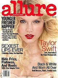
From my research of Vibe magazine, I adapted the idea of included a bold, bright colours, capitalised title, positioned at the top of the front cover, in order to capture my target audiences attention, and make them want to look at the magazine and potentially purchase it. Similarly the layout of cover lines was gained from looking at VIBE, as the font was clear, yet bold, attracting the customers attention, and informing them clearly of what was inside, and what artists were mentioned making them want to purchase the magazine. Similarly, by looking at the allure magazine, i chose how to position my model and photo. This magazine, has the model in centre frame, so that she is noticed, and recognised by the audience and potential customers.
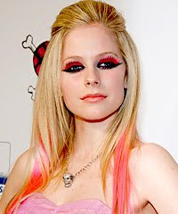
Similarly, when taking the photographs of my model, I needed for her to look like a real pop artist, in order for the magazine to seem logistic, so that the target audience would want to purchase the magazine. To do this I looked at other artists and their poses, and appearance, in order to make mine as similar as possible. To do this I looked at t he following artists:
The above photographs are of pop artists. From looking at these images of Britney Spears and Avril Lavine, I wanted my model to have a similar appearance. With this in mind, i chose to have the models hair with a quiff similar to Avril Lavines, whilst have a similar posture and gaze of the image of Britney Spears. I adapted these ideas from these artists, as they are well known artists, by the social group which I was targeting.


No comments:
Post a Comment